Tuesday, November 24, 2009

Lab 8: Census

Some Other Race Alone Population Map:


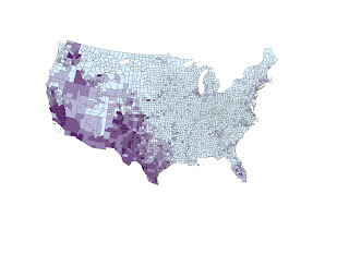
This map of "Some Other Race Population" shows that the density of population percentage of "other races" is strong in the Southwest. Because these states and counties border Mexico and other Gulf islands, the minority population is higher. Immigrants and the generations that follow them stay in the Southwest region.


Asian Population Map:


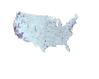
The Asian Population map shows the density of Asians in both the west coast and east coast of the country. The population is higher here because of the bordering oceans and the immigrants that came to America from Japan, Korea and China. The east coast has a higher population of Asian people because of the higher population in cities. Metropolis areas like New York, Boston, Philadelphia, etc... are melting pot cities with many immigrants and minorities. This explains the higher population of Asians in these cities than in other parts of the U.S.


Black Population Map:


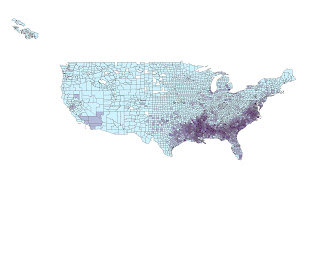
The Black Population is highest in the South. This can be explained by American history and the fact that slavery took place in the South, and since then, many African Americans have populated the South more than other areas in the U.S.

These maps visually display the trends in population that many people take for granted. Depending on where you are in the U.S., your worldview concerning other races changes drastically. This map shows that in big cities like New York and L.A., population is diverse, as well as many coastal areas. Places like the South and the southwest have diversity, but with fewer races in the mix. Our country is one that has attracted immigrants for centuries and now the racial make-up of the U.S. reflects that.
The GIS capabilities that allow for visually displaying information like this is so useful. Throughout this quarter, we have used GIS in many different ways and explored it's capabilities. It has been a challenge at times to learn such a complicated program, but the more I use it, the more things I discover it can do, and the more comfortable I get with it. My impression of GIS is that it is something I wish I could explore more, and something that I am continually impressed by. The unlimited uses for GIS are creating more and more ways for geographers to examine our world in an extraordinary way.

Lab 7: Mapping the Station Fire in ArcGIS

Station Fire Perimeter:


Station Fire Thematic Map:


The Los Angeles Station Fire, which burned during this past August and September, caused unthinkable damage to numerous cities and regions in Los Angeles. Particularly, this fire affected Griffith Park. In August alone, 18 homes and 2 firefighters were lost to the fire. Unfortunately, in California, fire is not unheard of. Many fires have burned through wildlife during the dry seasons. The Los Angeles Station fire burned over 100,000 acres and is the largest fire in Los Angeles history, and the 10th largest fire in California history.

There is some disagreement about the human impact on this fire, in terms of prevention. The U.S. Forest Service has been criticized on their late reactions. Furthermore, the fire itself was caused by arson. The human impact on both the start of the fire, the spread, and the eventual extinguishing of the fire, was significant to say the least. Humans are constantly interested in taking control of our surroundings and influencing them, whether it be positive or negative. The National Forests in the Los Angeles county area are one way that humans section off what they deem as "wild" and preserve it. This area was what burned drastically in the fire, because proper measures were not taken in regard to preventing this land to build up with brush and highly flammable debris, fallen from seasons past.

My first map shows the full extent of the Station Fire, as of September 2, 2009, along with the major highways and cities in Los Angeles county. The GIS program easily shows the boundaries of the Station Fire as it spread, but I chose to document the final extent of the fire. I added to this by placing major highways and city points to the map. As seen, the fire raged in a wildlife region, part of Angeles National Forest, and also affected places like Griffith Park. Cities were also affected, like Altadena, La Crescenta, and other parts of Los Angeles County. Even where homes weren't burned, the burden of the imposing flames and ash in the air caused stress and even panic. Now these areas have even more to worry about, including landslide possibilities.

My second map is thematic, and shows the fire in relation to the major parks in Los Angeles. The fire is shown burning much of the Griffith Park region. One can see the amount of land devoted to these National Forests and parks. Humans section these areas off in an attempt to "preserve" them, although the attempts backfired because of a lack of fire prevention tactics.

The GIS capabilities to overlay different attributes allows for geographers and scientists to interpret the problems of something like this fire, and determine what action needs to be taken on preparing ourselves in the future against these kinds of disasters.


Sources:
1. http://inciweb.org/incident/article/9640/
2. http://www.latimes.com/news/local/la-me-station-fire14-2009nov14,0,7917310.story
3. http://articles.latimes.com/2009/aug/31/local/me-fire31
4. "20 Largest California Wildland Fires (By Acreage Burned)" California Department of Forestry and Fire Protection
5. Wikipedia: California's Largest Wildfires

Tuesday, November 10, 2009

Lab 6: DEMs in ArcGIS

Original Map


Hillshade Model


Slope Map


Aspect Map


3D Image from 4 Different Angles


The area I selected for this lab exercise was Southern California, near San Bernadino. The area is very mountainous and elevated. There are dramatic peaks and deep canyons. Finding a color sample was difficult because some of the options made it even harder to see where the elevation was, but I found a 2-tone option to work best, and be the least confusing. Despite Jida's help, I still couldn't get the slope to work on my map.

Extent:
Top- -708533.691392
Left- 350085.661453
Right- 376937.393622
Bottom- -722333.745495

The Datum is North American 1983.

Tuesday, November 3, 2009

Week 6: Projections in ArcGIS

Original Map Projection from Lab: GCS WGS 1984, distance between Washington D.C. and Kabul was 7,018 miles.

Equidistant Cylindrical Map, distance from Washington D.C. to Kabul, Afghanistan was 5,075 miles.


Equidistant Conic Map, distance between Washington D.C. and Kabul was 6,966 miles.


Sinusoidal Map, distance between Washington D.C. and Kabul was 8,081 miles.


Cylindrical Equal Area map, distance between Washington D.C. and Kabul was 10,135 miles.


WGS 1984 Web Mercador Map, distance between Washington D.C. and Kabul was 10,164 miles.


Mercador Map, distance between Washington D.C. and Kabul was 10,123 miles.


This exercise brings to attention how relative these maps truly are. The distance between the cities of Washington D.C. and Kabul, Afghanistan was different in every map projection, with as much of a difference as 5,000 miles. The Mercador map versus the Equidistant Cylindrical map was the most extreme example. The different shapes and views of the maps affect the distance between these two cities. These maps are more accurate towards the center of the projection, but the further away you get from the center, the maps become more distorted.
It is useful to look at the different projections to acknowledge that while they may be mostly accurate up close, like on personal GPS devices, when viewing a large area they are often unreliable. Even globes are unreliable as a perfect model of the earth because they are perfectly spherical. It is nearly impossible to produce a perfect model of the earth, but geographers use these map projections to represent our world the best way possible. Being able to look at multiple map projections allows us to get a better idea of the way the world looks. Manipulating these maps on ArcGIS makes this reality even more tangible.
The pitfalls of using these map projections is that without viewing multiple projections, one's worldview is literally distorted. The combination of these maps, though contradicting, at least show that no specific one is to be completely relied on. Each is useful for a specific point of view, but none is flawless.
The positives of these map projections is that while they're not realistic in some cases, they allow maps to be worked on with the computer, on paper, and with more detail than a huge globe. We know the earth isn't flat, but sometimes that's the best way to work with it, even if certain parts are stretched or scrunched.

Tuesday, October 20, 2009

Week 4: Working with ArcGIS


I inserted my images as individual maps to allow me to stagger inputting them based on when I finished with each one. This proved to be beneficial to me, because the ones I finished and uploaded during week 4 weren't able to open during week 5 when I kept working on the project. One major pitfall that I ran into while working with ArcGIS was that the source of the information in a map has to be extremely organized. If a researcher was working on their own personal computer and did not have the task of moving files around, it wouldn't be as big of a hassle, but for me, working in a lab and then saving my files to a USB, the files were unorganized and the sources were lost, resulting in empty maps. I followed as many instructions as possible, yet I still ran into a bump.
Another pitfall of ArcGIS is that each step is so complicated and going back in the case of an error is difficult. Even after going through the program multiple times for this lab, I struggled with knowing exactly what I was doing when I was following the instructions. The terminology is very complicated and it would probably take me weeks or months of using the program daily to understand the big picture of what I was working with. Given that opinion of the program, I can appreciate the complicated and extremely important tasks it can complete when used by an expert.
Geographers use ArcGIS and other GIS programs to synthesize information in an extremely beneficial way. I see how important these processes are and the complicated nature of the program itself is understandable when seeing the amount of information it can bring together in countless ways.
Without GIS programs like this, a lot of information that is used to better our communities, cities, counties and countries would be much harder to come by. The process of creating a visualization to information that is otherwise numbers and tables is so useful, and those individuals that created this program and continue to learn more though it are true visionaries.

Tuesday, October 13, 2009

The real world of Curb Your Enthusiasm

The HBO show "Curb Your Enthusiasm" starring Larry David uses countless shots of real L.A. locations. Going to UCLA, I've noticed many of these backgrounds around my own area. This map is a compilation of as many locations as I can find from specific Curb Your Enthusiasm scenes.


View The real world of Curb Your Enthusiasm in a larger map


Neogeography, or translated more literally, new-geography, is indeed just that. New. There are always positives and negatives about things that are "new", and this is true with neogeography. Traditional geographers seem to be generally more comfortable with the old ways. Old maps, old techniques, standard definitions and ways of doing things when it comes to the discipline they love and study. Neogeography opens a door of chaos into these standardized, traditional methods. Some forms of neogeography disregard data and facts they way that old geography cherished them. For instance, online maps like Google maps and mapquest turn traditional mapping into a more unspecific, generalized form. There is less accuracy, and less of an emphasis placed on accuracy. GPS's turn traveling into a thoughtless task.
Just last month, I went on a trip to Oregon with my dad. We had never been there before, and after we landed in Portland, we took out the GPS, inputted our hotel address in Eugene, 2 hours away, and watched the GPS screen guide us there. There was very little navigation involved, and from my experience, I can say that I don't remember names of places along the way like I might have if I had to study signs and search for our off ramp. In more personal experience, my grandpa is a retired teacher and principle and loves giving me little lessons, usually regarding a map. He has numerous atlas books and fold out maps that immediately remind me of the old geography USGS maps we've studied in lab. To me, "old" or traditional geography maps make me view the world as something much larger than neogeography. Looking at Google Earth, seeing the whole world and being able to zoom in anywhere versus looking at a 7.5 minute map which includes so much detail, for instance, buildings, elevation, and bodies gives very different impressions of our world. Thinking about how many 7.5 minute maps make up the earth make me think that the earth is a huge planet that would take years to study by quadrangle maps. Google Earth shows me the entire planet on a computer screen and is interactive.
A loss of what is considered traditional and safe and standardized seems scary and unwelcome, but the benefits of neogeography can't be ignored. These interactive online maps are giving people who would otherwise know nothing about geography a chance to explore the world they live in, albeit in somewhat inaccurate ways.

Tuesday, October 6, 2009

Week 2: The 7.5 minute map

1. Beverly Hills Quadrangle
2. Canoga Park, Van Nuys, Burbank, Topanga, Hollywood, Venice and Inglewood are adjacent quadrangles.
3. The map was first created in 1966
4. National Geodetic Vertical Datum of 1927 and the North American Datum of 1983
5. The scale is 1:24000
6. a) 1200 meters b) approx. 1.89 miles c) 2.64 inches d) 12.5 cm
7. 20 f
eet
8. a)
Public Affairs Building- 37°4'26'' N, 118°26'20" W; 34.074N, 118.439W
b)
Santa Monica pier- 34°0'28" N, 118°29'59" W ;34.008N, 118.499W
c)
Upper Franklin Canyon Reservoir- 34°07'10" N, 118°24'37"W; 34.119N, 118.410W
9. a) 581 ft, 177 m
b) 141 ft, 43 m
c) 636 ft, 194 m
10. UTM Zone 11 is used.
11. 3763000 northing and 362000 easting
12. 1,000,000 sq. meters (each side 1,000 meters)
13.

Intersection (West-East) Elevation in feet
1 520
2 610
3 640
4 520
5 520
6 440
7 400
8 345
9 295
10 250
11 190
12 145


14. 14 degrees
15. The stream flows south
16.